Working through git

Generating a SSH key pair on Linux

By following the instructions given on gitlab.fabcloud.org I have used the following command to generate an SSH key
ssh-keygen -t rsa -C "alialsharakhat@gmail.com" -b 4096
After entering the path and password of the file where the SSH key will be stored, the key was copied by using the following command
xclip -sel clip < ~/.ssh/id_rsa.pub
Finally, I added my SSH key to GitLab by pasting the key in the ‘Key’ section under the ‘SSH Keys’ tab, and gave it an appropriate title.

Installing Git

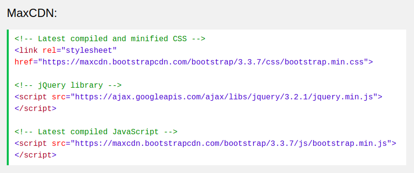
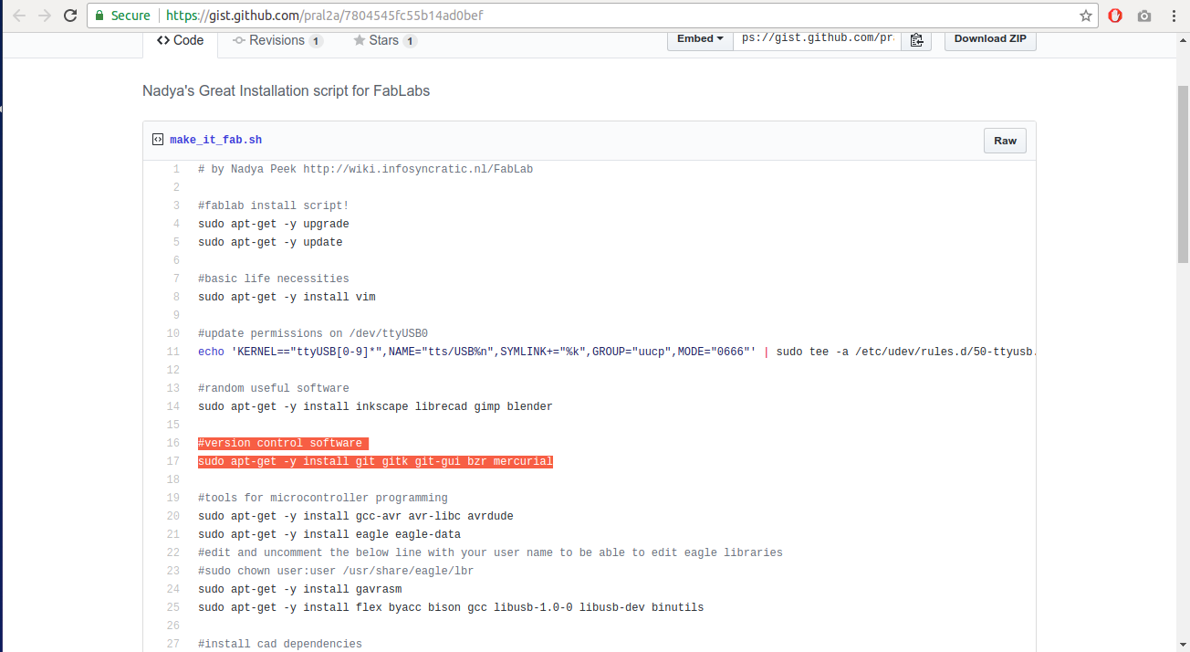
Git, along with the GUI, were installed by using the following command, which was found on ‘Nadya’s Great Installation script for FabLabs’
sudo apt-get -y install git gitk git-gui bzr mercurial
Nadya's script

Using Git Gui

Git Gui, as the name suggests, is an application that allows the user to use git on a GUI interface instead of using commands

Git Gui

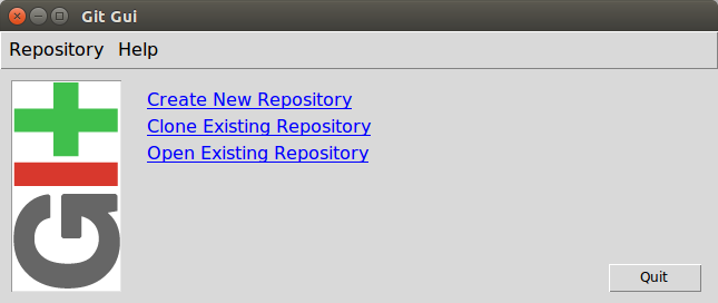
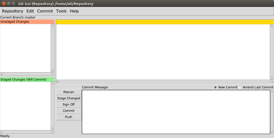
I selected clone existing repository directory, which will download everything saved on GitLab to the specified directory. Then I specified the HTTPS access token and the directory of the repository. The figure below shows the Git Gui interface.

Git Gui interface

The following command was run to assign my e-mail address to Get Gui
git config --global user.email "alialsharakhat@gmail.com"
In order to test if Git Gui updates my progress, the following steps were done:
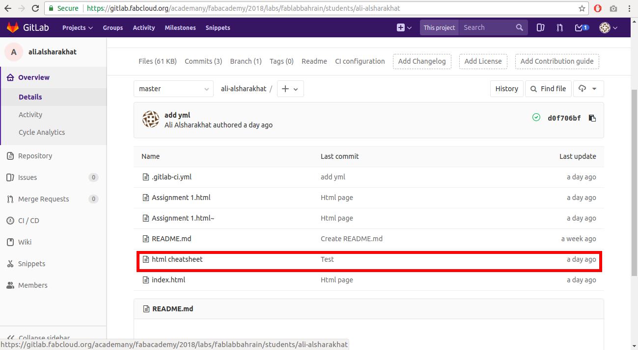
 However, Git Gui crashes every time I click on ‘Commit’. Therefore I have searched online for people who had the same issue in order to find a solution to the problem. I have tried various suggested solutions by many users but none of them worked. So, I switched to using git by using commands through the terminal.

Using git through terminal

The following commands were used to configure and push&pull through git.
git clone https://gitlab.fabcloud.org/academany/fabacademy/2018/labs/fablabbahrain/students/ali-alsharakhat.git #clones the repository to my directory
cd ~/ali-alsharakhat/ #changes my working directory to the repository directory
git config --global user.name "Ali Alsharakhat" #adds my username
git config --global user.email "alialsharakhat@gmail.com" #adds my email
git config --global push.default simple
chmod 600 ~/.ssh/id_rsa #Changes the permissions of my private key
eval "$(ssh-agent -s)" #Ensures that ssh-agent is enabled
ssh-add ~/.ssh/id_rsa #Adds my ssh key to the agent
git add --all #Adds the changes I did on my repository directory
git commit -m "Test" #Commits the changes and adds a message about the changes that I have made
git push #Pushes the changes to GitLab

Result

GitLab

It worked!

Designing a webpage


Learning how to use html

In order to make my first html page, I started with learning how to create the html page without using frameworks. I went through the following tutorial on htmldog.com and this is what I have learned:
htmldog

  1. In order to make my page, I will need to use a text editor and in my case I have used the “gedit” and “Mousepad” applications.
  2. html pages have to start with a header () which declares that it is a html page.
  3. They consist of opening tags and closing tags which indicate the beginning and the end of an element, but some tags are self-closing tags.
To make things easier, I have created the following tags cheat sheet for my reference html cheatsheet

The figure below shows the my result of creating the simple html page and the html code html before

code:
		<!DOCTYPE html>
		<html>
		<head>
			<title>Ali Alsharkhat</title>
		</head>
		<body>
			<img src="https://image.ibb.co/iSCimw/me.jpg" width="240" height="280" aly="me">
			<h1>Welcome!</h1>
			<h2>About me</h2>
			<p>My name is Ali Hashim Alsharkhat and I am currently working in United Stainless 
		Steel Company (USCO) in Bahrain. Graduated from the University of Bahrain Polytechnic 
		with a bachelors degree in Electronics Engineering in 2016 and was awarded for the best 
		Electronics industrial research project in Bahrain Polytechnic due to the outstanding quality 
		and presentation of the final year project.
		I am an over energetic person and I am always trying to keep myself productive.</p>
			<h2>My final project</h2>
			<p>My final project will be a device that fits inside a cup holder of a car. It calculates 
		the speed of the employee's vehicle and sends a message to the employer in the form of SMS whenever 
		the car's speed exceeds the speed limit and sends the location of the car at that time. It will also 
		feature speed restricted zones (near schools, hospitals, etc), where the speed limit will be significantly 
		less.</p>
			<h3>A rough sketch of the project</h3>
			<img src="https://image.ibb.co/mVGb6w/20180123_210740.jpg" width="500" height="850" aly="sketch">
		</body>
	</html>
	
After learning the basics of how to use html, I switched to using Bootstrap, which is a popular framework that makes web development easier. I used a tutorial that I have found on w3schools.com
w3schools tutorial

I have used MaxCDN which provides CDN support for Bootstrap's CSS and JavaScript.
MaxCDN

One important thing to keep in mind while using Bootstrap is that Bootstrap's grid system allows up to 12 columns across the page. These columns can be combined together to create wider columns
I have used a free Protfolio template from w3schools.com and used it to build my website. The figure below shows the html page before editing it.
html template

Template code:
		<!DOCTYPE html>
		<html lang="en">
		<head>
			<title>Bootstrap Example</title>
			<meta charset="utf-8">
			<meta name="viewport" content="width=device-width, initial-scale=1">
			<link rel="stylesheet" href="https://maxcdn.bootstrapcdn.com/bootstrap/3.3.7/css/bootstrap.min.css">
			<script src="https://ajax.googleapis.com/ajax/libs/jquery/3.2.1/jquery.min.js"></script>
			<script src="https://maxcdn.bootstrapcdn.com/bootstrap/3.3.7/js/bootstrap.min.js"></script>
			<style>
				/* Remove the navbar's default margin-bottom and rounded borders */ 
				.navbar {
				  margin-bottom: 0;
				  border-radius: 0;
				}
				
				/* Add a gray background color and some padding to the footer */
				footer {
				  background-color: #f2f2f2;
				  padding: 25px;
				}
			</style>
		</head>
		<body>

		<nav class="navbar navbar-inverse">
			<div class="container-fluid">
				<div class="navbar-header">
				  <button type="button" class="navbar-toggle" data-toggle="collapse" data-target="#myNavbar">
				    <span class="icon-bar"></span>
				    <span class="icon-bar"></span>
				    <span class="icon-bar"></span>                        
				  </button>
				  <a class="navbar-brand" href="#">Portfolio</a>
				</div>
				<div class="collapse navbar-collapse" id="myNavbar">
				  <ul class="nav navbar-nav">
				    <li class="active"><a href="#">Home</a></li>
				    <li><a href="#">About</a></li>
				    <li><a href="#">Gallery</a></li>
				    <li><a href="#">Contact</a></li>
				  </ul>
				  <ul class="nav navbar-nav navbar-right">
				    <li><a href="#"><span class="glyphicon glyphicon-log-in"></span> Login</a></li>
				  </ul>
				</div>
			</div>
		</nav>

		<div class="jumbotron">
			<div class="container text-center">
				<h1>My Portfolio</h1>      
				<p>Some text that represents "Me"...</p>
			</div>
		</div>
		
		<div class="container-fluid bg-3 text-center">    
			<h3>Some of my Work</h3><br>
			<div class="row">
				<div class="col-sm-3">
				  <p>Some text..</p>
				  <img src="https://placehold.it/150x80?text=IMAGE" class="img-responsive" style="width:100%" alt="Image">
				</div>
				<div class="col-sm-3"> 
				  <p>Some text..</p>
				  <img src="https://placehold.it/150x80?text=IMAGE" class="img-responsive" style="width:100%" alt="Image">
				</div>
				<div class="col-sm-3"> 
				  <p>Some text..</p>
				  <img src="https://placehold.it/150x80?text=IMAGE" class="img-responsive" style="width:100%" alt="Image">
				</div>
				<div class="col-sm-3">
				  <p>Some text..</p>
				  <img src="https://placehold.it/150x80?text=IMAGE" class="img-responsive" style="width:100%" alt="Image">
				</div>
			</div>
		</div><br>

		<div class="container-fluid bg-3 text-center">    
			<div class="row">
				<div class="col-sm-3">
				  <p>Some text..</p>
				  <img src="https://placehold.it/150x80?text=IMAGE" class="img-responsive" style="width:100%" alt="Image">
				</div>
				<div class="col-sm-3"> 
				  <p>Some text..</p>
				  <img src="https://placehold.it/150x80?text=IMAGE" class="img-responsive" style="width:100%" alt="Image">
				</div>
				<div class="col-sm-3"> 
				  <p>Some text..</p>
				  <img src="https://placehold.it/150x80?text=IMAGE" class="img-responsive" style="width:100%" alt="Image">
				</div>
				<div class="col-sm-3">
				  <p>Some text..</p>
				  <img src="https://placehold.it/150x80?text=IMAGE" class="img-responsive" style="width:100%" alt="Image">
				</div>
			</div>
		</div><br><br>

		<footer class="container-fluid text-center">
			<p>Footer Text</p>
		</footer>

		</body>
		</html>
	

Final result after editing the template

final html result

Code:

		<!DOCTYPE html>
		<html lang="en">
		<head>
			<title>Ali Alsharakhat - Home</title>
			<meta charset="utf-8">
			<meta name="viewport" content="width=device-width, initial-scale=1">
			<link rel="stylesheet" href="https://maxcdn.bootstrapcdn.com/bootstrap/3.3.7/css/bootstrap.min.css">
			<script src="https://ajax.googleapis.com/ajax/libs/jquery/3.2.1/jquery.min.js"></script>
			<script src="https://maxcdn.bootstrapcdn.com/bootstrap/3.3.7/js/bootstrap.min.js"></script>
			<style>
				/* Remove the navbar's default margin-bottom and rounded borders */ 
				.navbar {
				  margin-bottom: 0;
				  border-radius: 0;
				}
				
				/* Add a gray background color and some padding to the footer */
				footer {
				  background-color: #f2f2f2;
				  padding: 25px;
				}
			</style>
		</head>
		<body data-spy="scroll" data-target=".navbar" data-offset="50">

		<nav class="navbar navbar-inverse navbar-fixed-top">
			<div class="container-fluid">
				<div class="navbar-header">
				  <button type="button" class="navbar-toggle" data-toggle="collapse" data-target="#myNavbar">
				    <span class="icon-bar"></span>
				    <span class="icon-bar"></span>
				    <span class="icon-bar"></span>                        
				  </button>
				  <a class="navbar-brand">Ali Alsharakhat</a>
				</div>
				<div class="collapse navbar-collapse" id="myNavbar">
				  <ul class="nav navbar-nav">
				    <li class="active"><a href="#Home">Home</a></li>
				    <li><a href="#About">About</a></li>
				    <li><a href="#Weekly">Weekly Assignments</a></li>
				    <li><a href="#Final project">Final Project</a></li>
				  </ul>
				  <ul class="nav navbar-nav navbar-right">
				    <li><a href="#Contact">Contact Me</a></li>
				  </ul>
				</div>
			</div>
		</nav>

		<div class="jumbotron" id="About">
			<div class="container text-center">
				<br><br><img src="https://image.ibb.co/iSCimw/me.jpg" class="img-circle" style="width:20%" alt="Me">
				<br><br><p>My name is Ali Hashim Alsharakhat and I am currently working in United Stainless 
		Steel Company (USCO) in Bahrain. Graduated from the University of Bahrain Polytechnic 
		with a bachelors degree in Electronics Engineering in 2016 and was awarded for the best 
		Electronics industrial research project in Bahrain Polytechnic due to the outstanding quality 
		and presentation of the final year project.
		I am an over energetic person and I am always trying to keep myself productive.</p>
			</div>
		</div>
		
		<div class="container-fluid bg-3 text-center" id="Weekly">    
			<h3>Weekly assignments</h3><br>
			<div class="row">
				<div class="col-sm-3"><a href="Assignment 1.html">
				  <p>Principles and Practices, Project Managment</p>
				  <img src="https://placehold.it/150x80?text=IMAGE" class="img-responsive" style="width:100%" alt="Image">
				</div></a>
				<div class="col-sm-3"> 
				  <p>Week 2</p>
				  <img src="https://placehold.it/150x80?text=IMAGE" class="img-responsive" style="width:100%" alt="Image">
				</div>
				<div class="col-sm-3"> 
				  <p>Week 3</p>
				  <img src="https://placehold.it/150x80?text=IMAGE" class="img-responsive" style="width:100%" alt="Image">
				</div>
				<div class="col-sm-3">
				  <p>Week 4</p>
				  <img src="https://placehold.it/150x80?text=IMAGE" class="img-responsive" style="width:100%" alt="Image">
				</div>
			</div>
		</div><br>

		<div class="container-fluid bg-3 text-center">    
			<div class="row">
				<div class="col-sm-3">
				  <p>Week 5</p>
				  <img src="https://placehold.it/150x80?text=IMAGE" class="img-responsive" style="width:100%" alt="Image">
				</div>
				<div class="col-sm-3"> 
				  <p>Week 6</p>
				  <img src="https://placehold.it/150x80?text=IMAGE" class="img-responsive" style="width:100%" alt="Image">
				</div>
				<div class="col-sm-3"> 
				  <p>Week 7</p>
				  <img src="https://placehold.it/150x80?text=IMAGE" class="img-responsive" style="width:100%" alt="Image">
				</div>
				<div class="col-sm-3">
				  <p>Week 8</p>
				  <img src="https://placehold.it/150x80?text=IMAGE" class="img-responsive" style="width:100%" alt="Image">
				</div>
			</div>
		</div><br>

		<div class="container-fluid bg-3 text-center">    
			<div class="row">
				<div class="col-sm-3">
				  <p>Week 9</p>
				  <img src="https://placehold.it/150x80?text=IMAGE" class="img-responsive" style="width:100%" alt="Image">
				</div>
				<div class="col-sm-3"> 
				  <p>Week 10</p>
				  <img src="https://placehold.it/150x80?text=IMAGE" class="img-responsive" style="width:100%" alt="Image">
				</div>
				<div class="col-sm-3"> 
				  <p>Week 11</p>
				  <img src="https://placehold.it/150x80?text=IMAGE" class="img-responsive" style="width:100%" alt="Image">
				</div>
				<div class="col-sm-3">
				  <p>Week 12</p>
				  <img src="https://placehold.it/150x80?text=IMAGE" class="img-responsive" style="width:100%" alt="Image">
				</div>
			</div>
		</div><br>

		<div class="container-fluid bg-3 text-center">    
			<div class="row">
				<div class="col-sm-3">
				  <p>Week 13</p>
				  <img src="https://placehold.it/150x80?text=IMAGE" class="img-responsive" style="width:100%" alt="Image">
				</div>
				<div class="col-sm-3"> 
				  <p>Week 14</p>
				  <img src="https://placehold.it/150x80?text=IMAGE" class="img-responsive" style="width:100%" alt="Image">
				</div>
				<div class="col-sm-3"> 
				  <p>Week 15</p>
				  <img src="https://placehold.it/150x80?text=IMAGE" class="img-responsive" style="width:100%" alt="Image">
				</div>
				<div class="col-sm-3">
				  <p>Week 16</p>
				  <img src="https://placehold.it/150x80?text=IMAGE" class="img-responsive" style="width:100%" alt="Image">
				</div>
			</div>
		</div><br>

		<div class="container-fluid bg-3 text-center">    
			<div class="row">
				<div class="col-sm-3">
				  <p>Week 17</p>
				  <img src="https://placehold.it/150x80?text=IMAGE" class="img-responsive" style="width:100%" alt="Image">
				</div>
				<div class="col-sm-3"> 
				  <p>Week 18</p>
				  <img src="https://placehold.it/150x80?text=IMAGE" class="img-responsive" style="width:100%" alt="Image">
				</div>
				<div class="col-sm-3"> 
				  <p>Week 19</p>
				  <img src="https://placehold.it/150x80?text=IMAGE" class="img-responsive" style="width:100%" alt="Image">
				</div>
			</div>
		</div><br><br><br><br>

		<div class="container-fluid bg-3 text-center" id="Final project">    
			<div class="row">
				<div class="col-sm-2">
				</div>
				<div class="col-sm-8">
				  <p><h1>Final project</h1></p>
				  <br><img src="https://placehold.it/150x80?text=IMAGE" class="img-responsive" style="width:100%" alt="Image">
				</div>
			</div>
		</div><br><br>

		<footer class="container-fluid text-center" id="Contact">
			<p><h1>Do not hesitate to contact me!</h1></p>
			<p><h3>Name: Ali Alsharakhat</h3></p>
			<p><h3>Email: alialsharakhat@gmail.com</h3></p>
		</footer>

		</body>
		</html>
	
Main changes made to the template:


My final project

Short description

My final project will be a device that fits inside a cup holder of a car. It calculates the speed of the employee's vehicle and sends a message to the employer in the form of SMS whenever the car's speed exceeds the speed limit and sends the location of the car at that time. It will also feature speed restricted zones (near schools, hospitals, etc), where the speed limit will be significantly less.

A rough sketch of the project

simple sketch